How to use the clAMM Analyzer
A practical guide to the clAMM Position Analyzer — model your concentrated liquidity positions, visualize PnL across price ranges, and simulate leverage before you deploy capital.
Concentrated liquidity AMM positions are more capital-efficient than traditional liquidity pools, but that efficiency cuts both ways. A wide range misses most of the fees. A narrow range earns well — until price drifts out and you’re left holding an unbalanced bag. Layer in leverage and a liquidation price enters the equation. Before any capital goes on-chain, it helps to be able to see exactly what you’re stepping into.
The clAMM Analyzer is a browser-based tool for modeling concentrated liquidity positions. No wallet, no connection, no data sent anywhere — just a canvas that reacts to your inputs in real time.
Why model before you deploy
A cLAMM position isn’t a simple bet. Its payoff depends on where price is relative to your range at any given moment, how much impermanent loss has accumulated since entry, whether you’re borrowing and in which direction, and what your liquidation threshold is. Each of these dimensions interacts with the others. Adjusting one changes all the rest.
The analyzer makes those interactions visible. You can drag your range bounds left or right and watch the PnL curve shift. You can dial up leverage and see your liquidation price move toward you. You can switch between QUOTE and BASE debt to understand how your directional exposure changes. None of this requires a live position or real money.
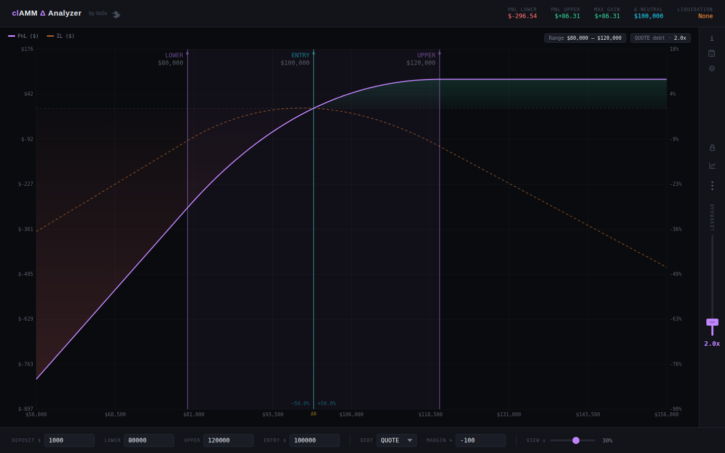 The full analyzer — PnL curve, range band, live header metrics, and the leverage rail on the right.
Opening the tool
Access the tool form the sidebar. It runs entirely client-side. Open it, and the default state loads a BTC-style position with a 2× leverage example so you have something to look at immediately.
Setting up your position
The input bar at the bottom of the screen holds all the position parameters.
 Every position parameter in one row: deposit, range bounds, entry price, debt type, margin, and view width.
Deposit $ — your equity. This is the amount you’re putting up, before any borrowing.
Lower / Upper — the price bounds of your concentrated liquidity range. Everything inside this band earns fees; outside it, you’re fully converted to one asset and earning nothing.
Entry $ — the price at the time you deposit. This sets where your initial asset split sits within the range and anchors the PnL calculation.
Debt — which asset you’re borrowing. QUOTE means borrowing the stable (e.g. USDC), which tilts the position long: you profit more if price rises. BASE means borrowing the volatile asset, which hedges delta — you profit more if price stays flat or falls toward your range center.
Margin % — the loss threshold at which the position gets liquidated. -100 means you lose your full deposit. A tighter value like -80 sets a higher liquidation price and less room to run.
View ± — the width of the chart’s x-axis window, expressed as a percentage around the entry price. Narrowing it zooms in; widening it shows how the PnL curve behaves far out of range.
Reading the chart
The chart is the core of the tool.
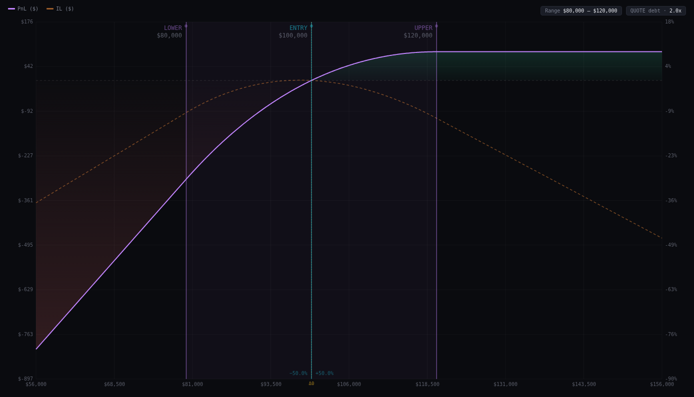 The PnL curve (purple), IL curve (orange dashed), profit zone (green fill), loss zone (red fill), and the three draggable vertical lines.
The purple curve is net PnL in dollars, plotted across the full price axis. It accounts for fees earned while in range, impermanent loss, and debt cost.
The green fill marks every price where your position is profitable at the moment of exit. The red fill marks loss territory.
The orange dashed curve is impermanent loss in isolation — useful for separating the fee-earning performance from the IL drag.
The shaded band between Lower and Upper shows your active range. Inside the band, the position is earning fees. Outside it, it’s sitting in a single asset.
The three vertical lines — Lower, Upper, and Entry — are draggable. Click and drag any of them to reposition in real time. The entire chart recalculates as you drag. Below Entry, two percentage labels show how far the entry sits from each bound as a fraction of the total range width, mirroring how the Uniswap v3 UI describes position placement.
Hovering over the chart shows a tooltip with the price at cursor, PnL in $ and %, IL in $, and the net delta in the base asset.
Header metrics
The five metrics at the top summarize the position at a glance.
 PnL Lower, PnL Upper, Max Gain, Δ-Neutral, and Liquidation — all live.
PnL Lower — what you make or lose if price hits your lower bound exactly. With QUOTE debt and a wide range, this is typically a significant loss. With BASE debt it’s often less severe.
PnL Upper — same logic for the upper bound.
Max Gain — the best PnL value visible in the current chart window. If you’re on QUOTE debt with an upward-biased range, this often sits above Upper where fees are no longer being earned but the unleveraged position is deep in profit.
Δ-Neutral — the price, or pair of prices, where your net PnL equals zero. These are your break-even points. If there are two, you’re profitable inside a band and losing outside it.
Liquidation — the price at which the position gets liquidated given your margin setting and leverage. Click any metric to toggle between dollar and percentage display.
Adjusting the range interactively
The fastest way to develop intuition for a position is to drag the lines. Grab the Lower or Upper bound and pull it — the chart updates without any lag. You can narrow the range to increase fee density at the cost of a closer liquidation and higher IL. You can shift the entire range directionally by moving both bounds. You can move Entry to model an entry at a different point in the range.
Modeling leverage
The vertical slider on the right rail controls leverage.
Drag the handle up to increase leverage, down to reduce it. The current multiplier displays below the slider. As leverage rises, the PnL curve steepens in both directions — profits are amplified, but so are losses, and the liquidation price moves closer to the current range.
Leverage interacts directly with the Debt setting. At 1× with QUOTE debt, you have a plain leveraged-neutral LP. At 3× with QUOTE debt, you’re essentially long with significant liquidation risk to the downside.
Comparing multiple ranges
The range manager (grid icon in the lever rail) lets you maintain up to four independent ranges simultaneously — R1 through R4, color-coded in purple, orange, green, and blue. Each range has its own Lower, Upper, Entry, deposit, leverage, and debt settings.
Switch between ranges using the dropdown in the top-right corner of the chart. The inactive ranges appear as dimmer overlaid curves, giving you a direct visual comparison of how different configurations perform across the same price axis.
Exporting and sharing
The save icon at the top of the lever rail opens the export dropdown.
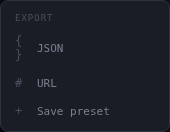 JSON, URL, and preset options.
Export JSON downloads a full snapshot of all ranges and settings as a .json file. Useful for archiving a setup before you deploy it on-chain.
Export URL base64-encodes the entire state into a URL hash. Share the link and the recipient opens the tool pre-loaded with your exact configuration — useful for showing a position setup to a counterparty or posting in a group chat.
Save preset stores the current state in localStorage so you can return to it in the same browser without a link.
Wrapping up
The clAMM Analyzer is one of several browser-based DEX tools. The goal with all of them is the same: bring the math into view before the transaction happens. If you’re deploying concentrated liquidity — especially with leverage — the ten minutes spent in the analyzer will tell you more than most post-deployment dashboards.
Tool link: clAMM Analyzer →
Questions or feedback: @ilo_0x on X.